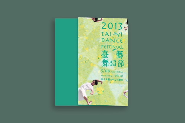
A Visual Design Makes Dance Festival Blossom
What is your impression about school and being a student? I guess most of us have been a student. And it is also the time that we are in our most innovative selves.
When I received this project, the first impression popped up in my mind was energy. Because it was a project about the dance festival of Tai-Yi university. It let me associate with choreography, setting, lighting, and everything that needed a power of creativity. So after brainstorming, I chose the idea of ”blossom" to be the concept. The blossom flower just like all their hard working would show in that moment. When the flower blossom, It’s also like dance through the wind. This idea could fully show the spirit of the dance festival.
How did I show “blossom” concept on the design? I arranged dancers photo similar to the shape of the flower. The poster that you can connect one poster to another in all sides making it a continuous pattern which represents an unlimited creativity. The green background could be grassland and the white dress could be the flower. The image was like a boundless grassland and people could run everywhere without restriction. It also followed the concept. Both of the colors matched pretty well.
For the other campaign design, like the leaflet, I decided to make it looked like a paper airplane. I made this unusual form of design because I wanted it to catch people's attention. It can also be arranged in different arrays such as heart shape, bouquet, and airplane. It symbolized hope, future, and creativity.


留言
張貼留言